How to Become a Media Favourite in 2026
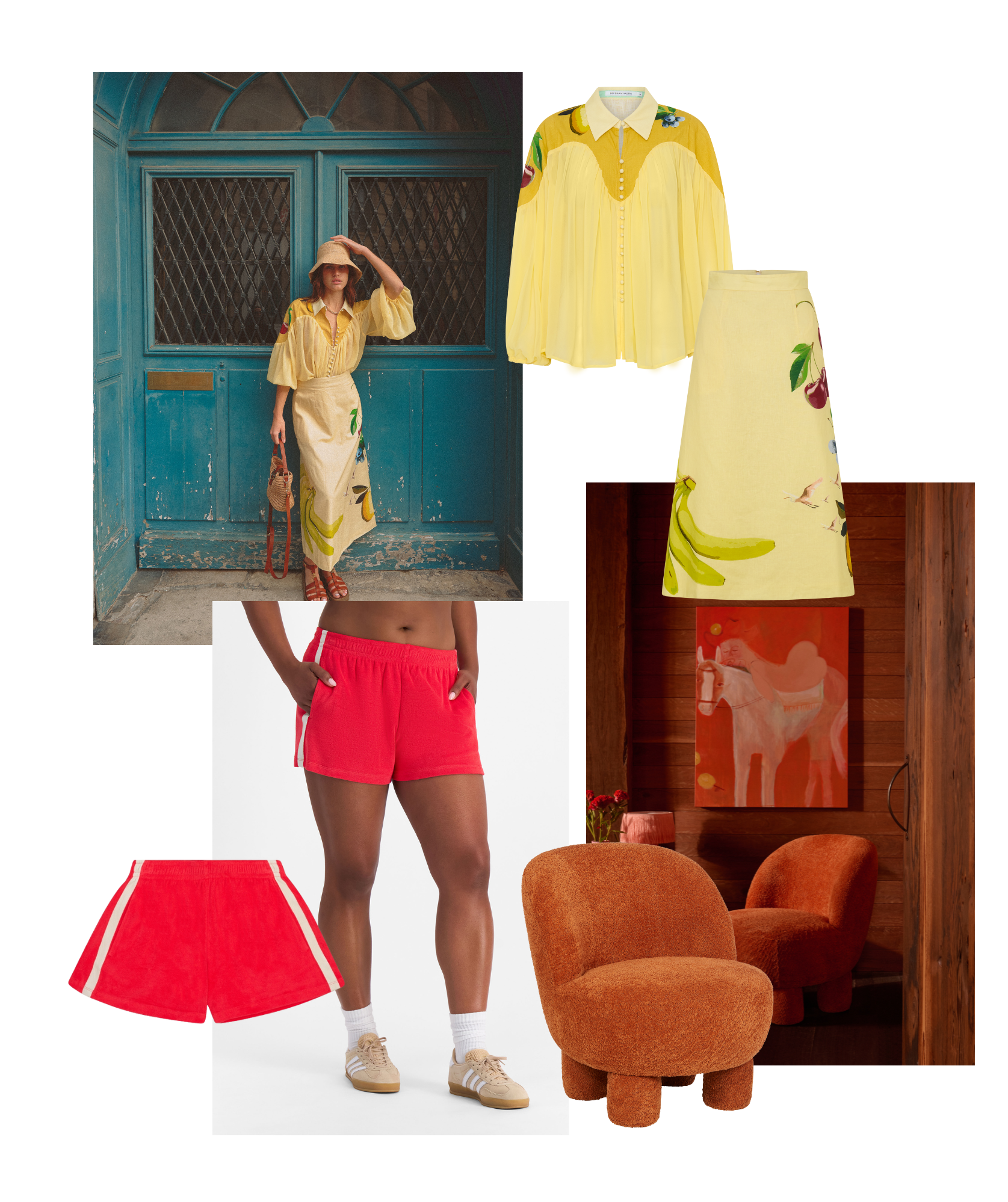
All images available via Flaunter
In 2026, product photography and visual storytelling are your ultimate tools for getting noticed by the media and elevating your PR game. But this isn’t just about creating beautiful content – it’s about presenting content in a manner that’s accessible, searchable, and ready when the media needs it.
The media landscape has changed. Traditional media outlets have merged with their online counterparts, creating a constant demand for fresh, high-quality imagery. Journalists and editors need SO MUCH content that brands now have an unprecedented opportunity to share their own visuals.
But with so many options available, it’s up to brands to make it as easy as possible for media to find what they need. If your content isn’t in the right place, at the right time, and easy to download, you’ll miss out on coverage.
This fast-paced cycle often leaves brands scrambling, wasting time and money on expired file transfer links, clogged inboxes, and messy spreadsheets. To make matters worse, most systems for distributing visual content aren’t designed for industries that rely on product imagery to sell.
So, what’s the secret to becoming a media favourite this year? It’s not just about creating stunning product photography – it’s about making your content:
High-quality – media-ready and styled to match editorial standards.
Easily accessible – available on-demand, without chasing links.
Organised and searchable – so media can find exactly what they need, fast.
That’s where Flaunter comes in.
Flaunter acts as your digital PR assistant and all-in-one PR software, giving journalists and stylists instant access to your hi-res product images in a digital showroom. No more inbox chaos. No more missed opportunities.
Flaunter combines powerful digital PR tools, media relations software, and PR automation software into one platform – helping you get featured in the media, track press mentions, and measure PR success. Whether you’re looking for DIY PR, PR tools for small businesses, or scalable solutions for PR agencies managing multiple clients, Flaunter is the ultimate brand communication platform for modern media relations.
So, whether you’re on Flaunter or not, here are our top tips for creating content that’s accessible, media-ready, and impossible to ignore – so you can stand out and become a media favourite this year.
1. Create High-Quality Visuals That Media Can’t Resist
We already know that with high-quality content comes great exposure. Sure, not everyone has access to professionals, but with affordable DSLR’s and sophisticated mobile cameras at your fingertips, great content can be created in minutes. That being said, it is vital that you take time to do your research before shooting.
Look through the magazines and blogs that you want your product featured in and take note of how the photos are presented. Then you’ll be able to replicate that look when creating your own images.
Ask yourself: When presented to the media, would this be their photo of choice?
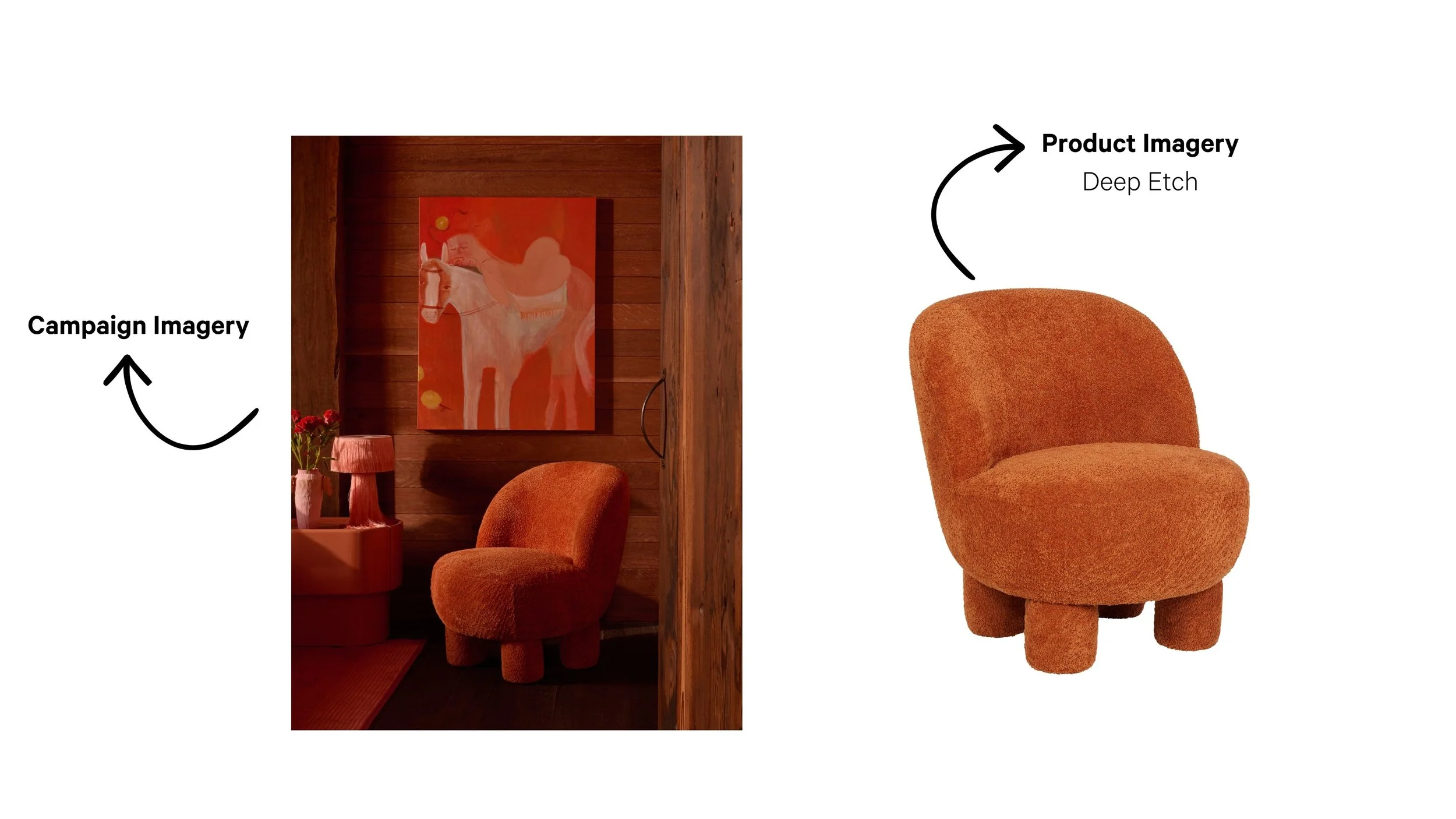
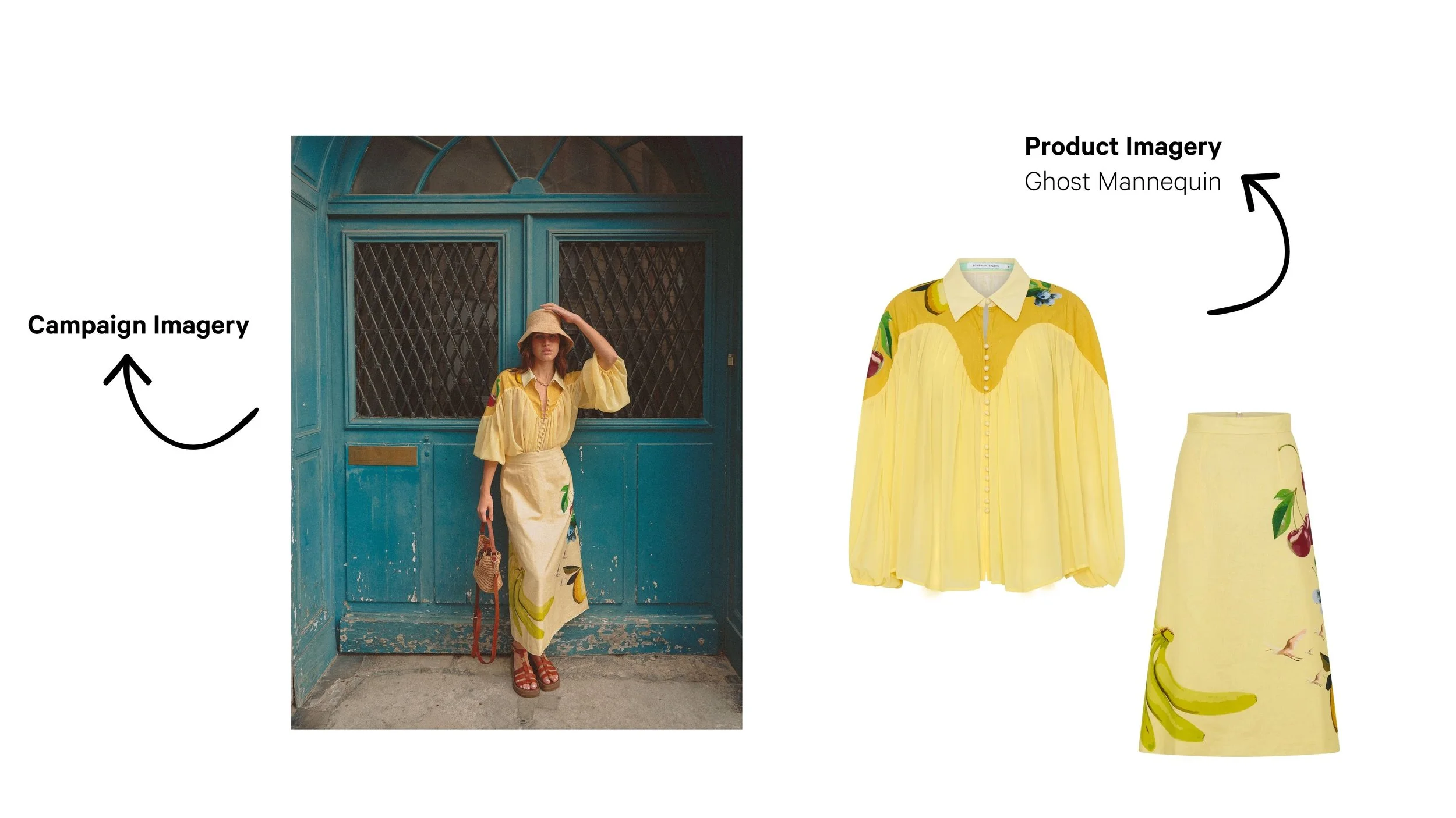
For example, some magazines like to use ‘on mannequin’ shots, while others prefer to use deep etch product photos. Knowing what your target media wants ensures your visuals hit the mark.
Top Tips for Media-Ready Photography
Before you start shooting, keep these essentials in mind:
Keep Product Photography Simple
A clean background is key. A white wall or sheet works perfectly to keep the focus on your product – not what’s behind it.Use Natural Light
Natural light gives you true-to-life colours and saves you from wrestling with complicated lighting setups.Show Variety
Provide multiple formats: products on a white background, transparent background. lifestyle/context shots, multiple angles.
The more options you give, the easier it is for media to choose your image for their feature.
Why Media Use Different Imagery Types
Not all images are created equal – and not all media outlets want the same thing. The type of imagery you provide can make or break your chances of being featured. Here’s why different formats matter:
Campaign Shots
Think styled, editorial images that tell a story. These are perfect for magazines, blogs, and social media features where the goal is to inspire and engage. Campaign shots show your product in context and help editors create visually rich layouts.E-Commerce Shots
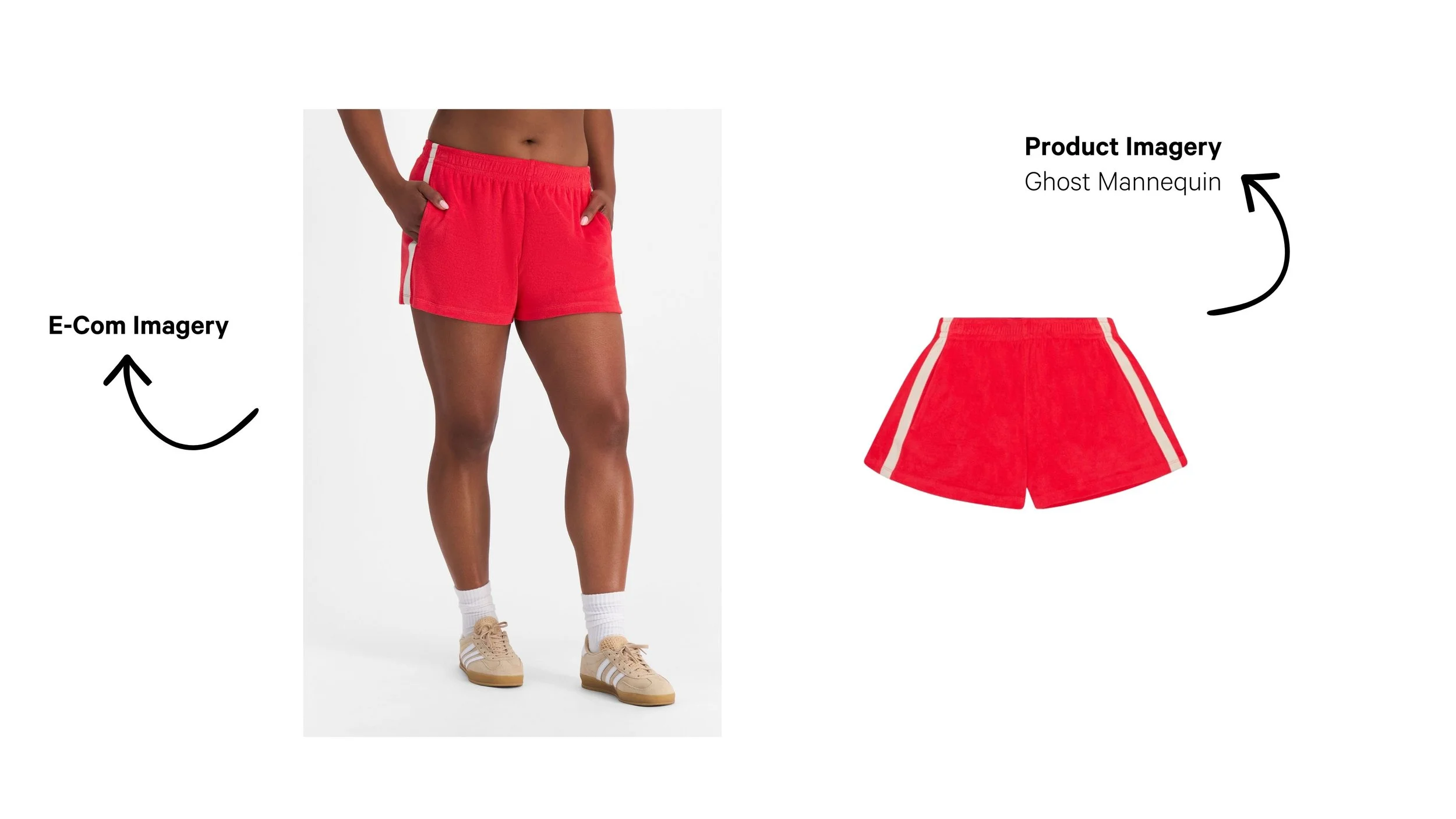
Clean, consistent product images on a white background are essential for online shopping platforms and product round-ups. They’re simple, clear, and make it easy for readers to focus on the product details.Ghost Mannequin Shots
Fashion media love these for clothing features because they show the garment’s shape without distractions. It’s a professional, polished look that works well for catalogues and editorial spreads.Deep Etch Images
These are products cut out on a transparent background. They’re a designer’s dream because they can be dropped into any layout without clashing with other elements. Perfect for flat-lay collages, shopping guides, and digital features.
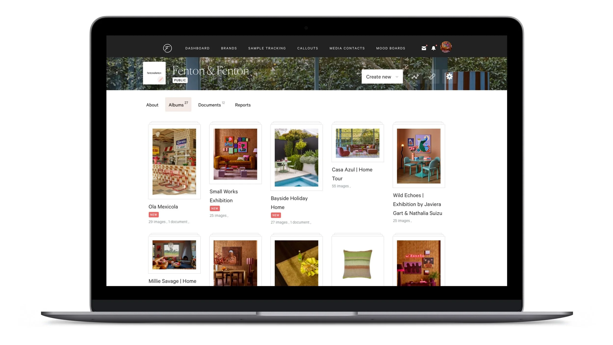
Here’s a homeware example from Flaunter favourite, Fenton & Fenton, showcasing how you can show the same product in different formats:
Another to see how it works in fashion, courtesy of Bohemian Traders:
And finally, BONDS with an E-Commerce comparison example.
Most media and retailers LOVE (as in kill for) access to images of products on a white background. So, when you’ve taken your in-context shots it is highly recommended that you edit them by removing the background to make your content instantly more useful. Hot tip – you can use Pixc as a photo editing service or Canva’s background remover tool to make this process super efficient!
Remember that above all, being consistent is key.
Try to review this checklist after each photoshoot just to make sure:
Do your images all have a similar brightness, colour and clarity?
Do they complement your brand personality?
Are the backgrounds consistent?
Can you clearly see your products?
Do you have various angles and photo types to make sure you’re ready for all types of media requests?
And if you’re wondering what quality, resolution and formats work best for Flaunter and media outlets, check out our ultimate guide to media-ready imagery.
2. Make Your Visual Content Easily Accessible
Ask anyone in the media who works with images and they’ll tell you their number one pet hate: receiving image files in a format that’s hard to access.
Picture this: You’re a journalist working on a feature about party dresses. You email 100+ brand contacts for imagery and suddenly your inbox explodes with 50 emails, each 20MB in size. That’s 1GB of data clogging up your day. Then, another 50 brands send zipped files via file-transfer tools – now you have to download entire folders just to check if one image is suitable. Stressful, right?
These outdated practices might make sending files easy for brands, but for media, they turn an already busy day into chaos. The solution? Cloud-based tools that make your content accessible, searchable, and ready when the media needs it.
Why Flaunter Dominates Over Other File Sharing Tools
Here’s the difference:
Google Drive & Dropbox
Sure, they let you share files. But they don’t make your content searchable for journalists, they don’t track downloads, and they definitely don’t help you build media relationships. These tools were built for internal teams, not for the fast-paced world of media outreach.Flaunter
Flaunter is in a league of its own. It’s not just storage – it’s a digital PR assistant and all-in-one PR software that puts your brand assets exactly where media are already looking. Flaunter acts as a brand communication platform and media outreach database, giving journalists instant access to your hi-res imagery 24/7. No inbox chaos. No expired links. No guessing games.
3. Make Your Content Organised, Searchable and Ready to Go
Creating beautiful visuals is only half the battle. The real magic happens when your content is easy to find, download and use. Media work in a 24/7 news cycle, so if they can’t access your imagery instantly, they’ll move on to the next brand. The easiest way to become a media favourite? Give them what they need before they even have to ask.
Here’s what that looks like on Flaunter.
Start by organising your imagery into a central press centre. Flaunter makes this effortless by allowing you to create albums by product, collection or image type – campaign shots, lifestyle images, deep etch, ghost mannequin, and e-commerce formats. This level of organisation means editors can find exactly what they need without digging through endless folders.
Include all essential details linked to each image:
Brand name
Price (RRP)
Stockist details (e-commerce URL)
In-store date
When you combine organised imagery with complete product details, you make life easier for journalists, stylists and creators – and that’s exactly what gets you featured.
Oh, and the best part? You can track what you share with Flaunter.
Who says PR can’t be measured? That was the old days. When you share your visuals, make sure you’re using a platform that tracks every interaction – views, downloads, and follows. This kind of insight is gold for your business, yet it’s traditionally been hard to measure.
Think about it: just like you want to know how many people opened your last email campaign, you should know how many journalists downloaded your product images. That data helps you understand what’s working, what’s not, and where to focus next.
Where to From Now?
So, what’s next? If you’re already on Flaunter, now’s the perfect time to do a quick guided stocktake of what you’ve got on your profile. Ask yourself:
Do you only have deep-etch images? If so, look into adding campaign shots or lifestyle imagery to give media more options.
Are your images missing key details like price, stockist info or in-store dates? Get onto it – these essentials make your content instantly usable.
Is everything organised into albums by collection or image type? If not, tidy it up so editors can find what they need fast.
And if you’re not on Flaunter yet, what are you waiting for?
Sign up for a free two-week trial and start building your press centre today — you’ll be one step closer to becoming a media favourite in 2026.
Still have questions? Reach out to our team at hello@flaunter.com or head to flaunter.com to explore the full list of features.
